The integral of sec(x) is well known to any beginners calculus student. Yet this integral was once a major outstanding maths problem. It was first introduced by Gerardus Mercator who needed it to make his famous map in 1569. He couldn’t find it and used an approximation instead. The exact solution was found accidentally 86 years later without calculus in 1645. It then took another two decades until a formal proof was given in 1668, 99 years after Mercator first proposed the problem.
Update 13 March 2021: added a note on how Napier calculated logarithm trigonometry tables. This was prompted by a correction raised in a discussion of this post on HackerNews.
Update 10 October 2021: the great circle and rhumb line images are now made with a script that uses Cartopy. Previously they were made with a Matlab application. You can see the new script at my Github repository and enter your co-ordinates to generate your own lines.
As this comic by SMBC rightly teases, the history of mathematics is often not so straightforward. Theorems, formulas and notation that are routinely discussed in class, were once insights or accidents themselves. This is the story of one such formula, the integral of the secant. I first read about it almost a decade ago when I got interested in cartography: the science and art of map making.1 This integral is of vital importance to the Mercator map and therefore many online maps that use it like Apple Maps and Google Maps.
This story has been told several times before: see 1, 2 or 3. But these are all journal articles, consigned mostly to academics. I want to present it here in a less formal and more colourful setting to make it more accessible.
This is an article about mathematics so familiarity with the following is helpful: algebra, trigonometry, radians and basic calculus. These are usually covered in advanced high school maths classes or first year maths courses.
First year maths
In first year maths at university after a month of differentiation we were starting the inverse problem: integration. Differentiation is the mathematics of finding gradient functions for curves. Integration is the mathematics of inverting this - given a gradient function, what is the curve? My lecturer was introducing the integration of trigonometric functions. He started off with:
\[\int \sin(x) dx = -\cos(x) + c \:\text{ and } \int \cos(x) dx = \sin(x) + c\]This relationship made sense because sine and cosine derivatives were opposites. Just had to be careful of minus signs. Next he derived the integral for the tangent:
\[\int \tan(x) dx = \int \frac{\sin(x)}{\cos(x)}dx = -\ln|\cos(x)| + c\]Ok, that was tricky. It was not immediately obvious that the inverse of the chain rule could be used here, because the function $\cos(x)$ was present with its derivative $\sin(x)$. But given enough thought it made sense. Then he said, this is the integral of the secant and learn it off by heart:
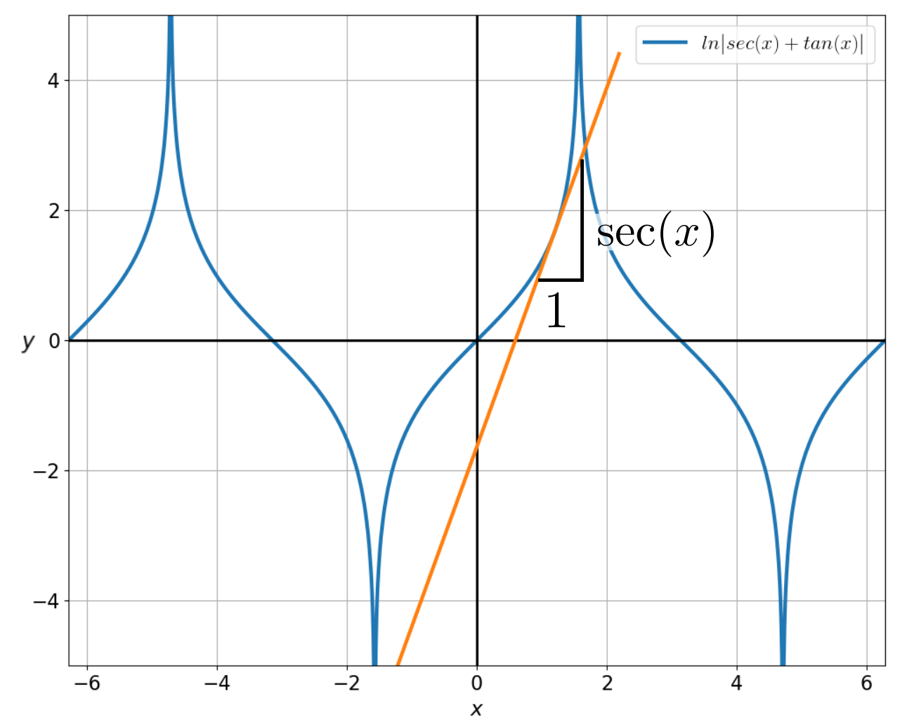
\[\int \sec(x) dx = \ln|\sec(x) + \tan(x)| + c\]OK, where did that come from? My lecturer offered no explanation. It was easy to verify that it worked by finding the derivative.2 (Paper 2 has a more complex proof using only integration.) But how had he come up with that?
I think at this point most first year calculus students like me have the following fleeting thoughts:
- Integration is much harder than differentiation.
- Some mathematician must have stumbled on this through differentiation first.
- It doesn’t matter anyway because where will I ever use this?
Actually number 1 is true as many a student can testify after writing a test. Number 2 is false - in fact it was found by a teacher while looking at raw numbers. Such a method for finding an integral is so unusual that one might conjecture it is the only integral that has been found like this. Surely in calculus class where raw numbers are so rare you would be laughed at if you attempted to solve an integral like that. Lastly, number 3 remains true for me. But this doesn’t mean this integral isn’t useful - it is used to construct the Mercator map. That is why a teacher was crunching numbers when he serendipitously realised what the formula was.
Quick revision: trigonometry
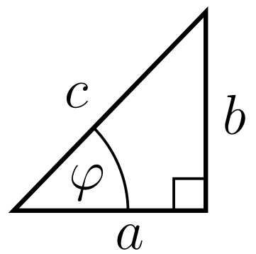
The secant is a standard trigonometric function. It is defined as the ratio of the hypotenuse $c$ to the adjacent side $a$ for an angle $\varphi$ in a right angled triangle. In mathematical notation the definition is:
\[\sec(\varphi) = \frac{c}{a}\]It is the reciprocal of the more widely used cosine function:
\[\sec(\varphi) = \frac{1}{\cos(\varphi)}\]Here are the graphs of the secant and cosine for the angles from $-2\pi$ (-360°) to $2\pi$ (360°):
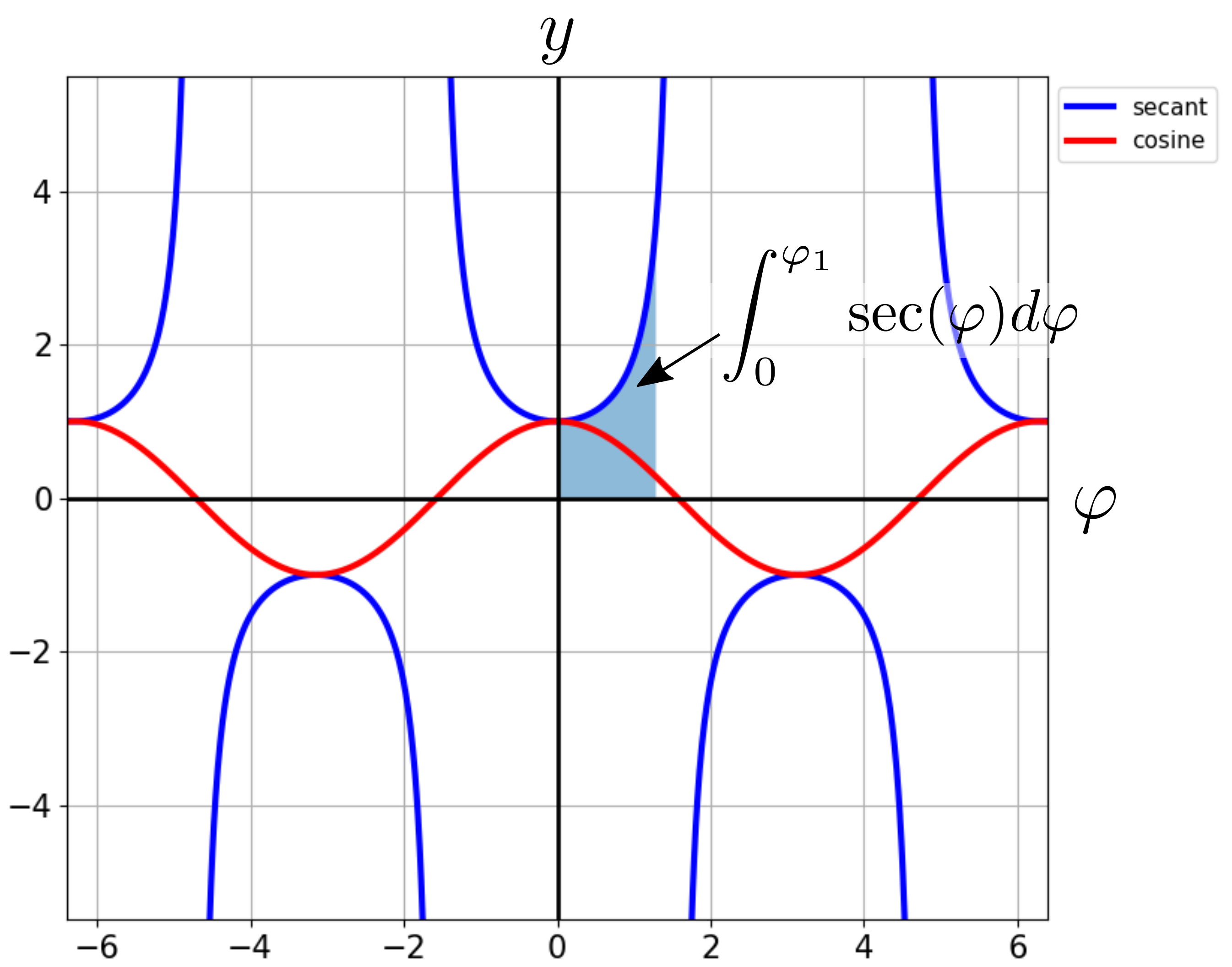
The integral of the secant can be interpreted as the area under the graph.3 This is illustrated by the shaded region.
An introduction to cartography
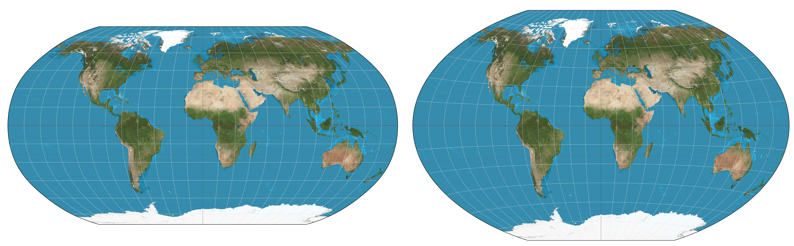
The earth cannot be projected onto a flat map without distortion. Over the years cartographers have devised many different map projections which try to balance minimising distortion with other properties. They come in all shapes and sizes. Lists of these projections can be found here or here. I will explain two of the simplest here, which will help with understanding the Mercator map in the next section.
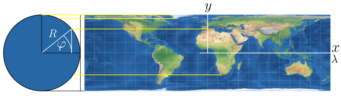
All map projections can be represented as equations that transform spherical co-ordinates to flat map co-ordinates.4 The co-ordinates on the sphere are the angles $\varphi$ and $\lambda$. These correspond to lines of latitude (parallels) and longitude (meridians) respectively. The co-ordinates on the flat map are $x$ and $y$. A map projection is therefore a transformation from $\varphi$ and $\lambda$ to $x$ and $y$.
One of the simplest and oldest known projections is the equirectangular projection:
It is made by mapping meridians and parallels to vertical and horizontal straight lines of constant spacing. This has the effect of stretching out objects along the parallels. The equations for this projection are:
\[\begin{align} y &= R\varphi\\ x &= R\lambda \end{align}\]While the equations are simple the construction process can be hard to visualise. Here is my attempt:
The equirectangular map has a total area of $(2\pi R)(\pi R)=2\pi^2 R^2$ while the surface area of the sphere is $4\pi R^2$. Therefore this projection distorts the area by a factor of $\frac{\pi}{2}\approx1.57$.
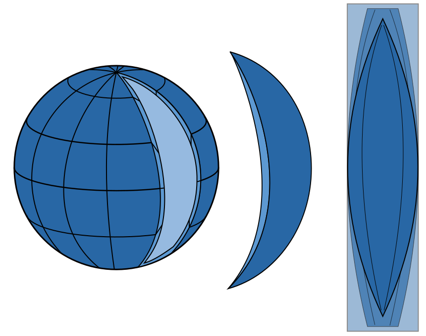
A different kind of projection can be obtained by projecting lines from the sphere onto the mapping plane. An example is the Lambert cylindrical projection. It is made by wrapping a cylinder around the sphere and projecting points onto it via lines parallel to the $x$-axis. Here is a visualisation of this construction:
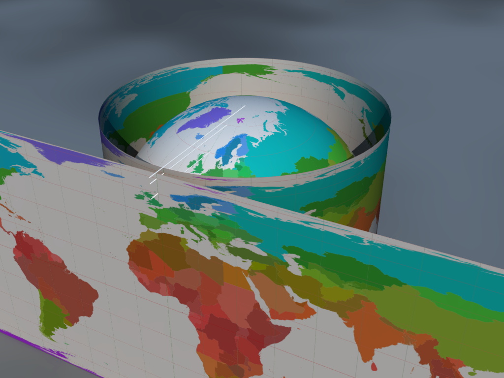
And here is a cross section of the sphere along side the final map:
The equations are:
\[\begin{align} y &= R\sin(\varphi)\\ x &= R\lambda \end{align}\]For objects near the equator this results in very little distortion such as for Africa. But objects near the poles are compressed because of the sphere’s curvature. This can be seen clearly with Greenland.
This map has the useful property that its area is equal to the surface area of the sphere. The area of the flat map is $(2\pi R)(2R) = 4\pi R^2$ which is the same as that of the sphere. Thus, while objects are distorted, their areas are still correct. The relative scale of Greenland to Africa is therefore accurately represented in this map.
The Mercator map
In 1569, Gerardus Mercator wanted to make a global world map that would be useful for navigation. He lived in a time when sailing across vast ocean distances was the norm. (In 1492 Christopher Columbus had discovered America by sailing all the way from Spain.) The maps shown above are fine for artistic impressions and applications but not for navigation. The distortions prevent doing any accurate distance and bearing measurements on the map. At a local level lines (eg. roads) which in reality intersect perpendicularly to each other would appear to be slanted with respect to each other.
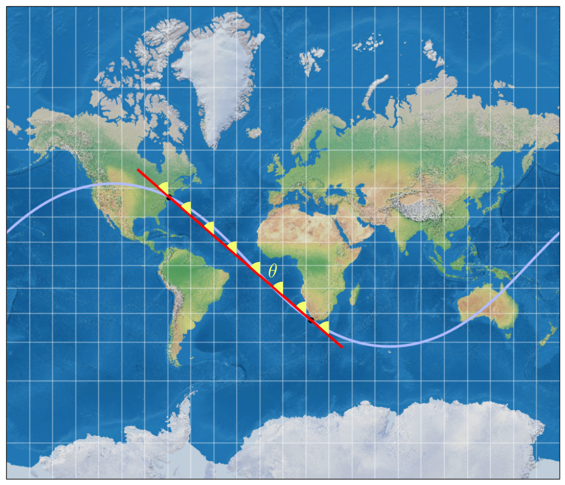
In particular Mercator wanted to make a map where rhumb lines would be straight. Rhumb lines are curves of constant bearing relative to meridians. To follow a rhumb line a navigator only needs to maintain the same bearing on their compass for the whole journey. For example, here is the rhumb line through modern day New York and Cape Town:
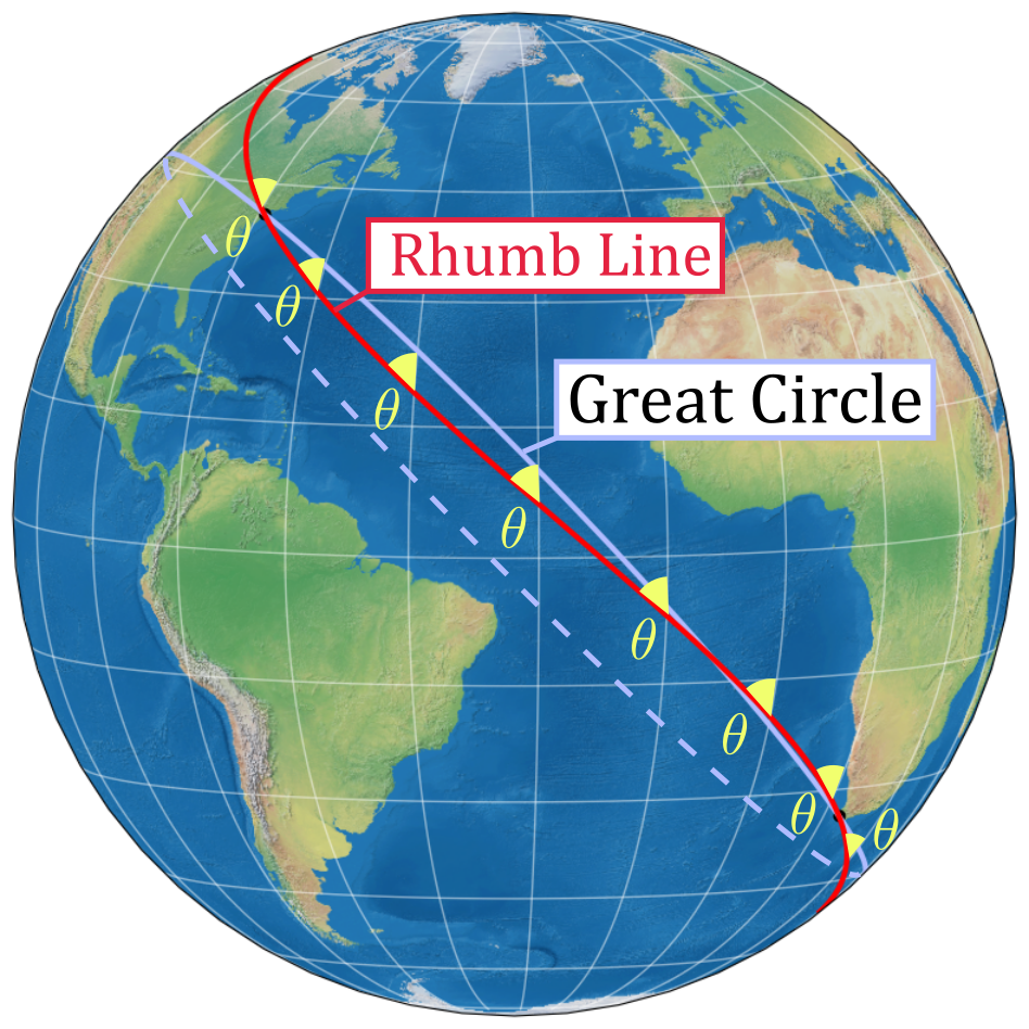
At each point along the rhumb line the angle $\theta$ with the meridian is 48.56° which corresponds to a bearing of 311°26’18’’ from Cape Town to New York. I’ve also shown the great circle which is a circle whose centre lies on the centre of the sphere. Traveling along the great circle is always shorter. In this case the distance is 12550 km instead of 12600 km along the rhumb line. With modern technology it is easy for ships and aeroplanes to stick to the great circles. But back in Mercator’s day this was rather difficult. So sailors preferred to stick to rhumb lines. They would rather get to their destination by traveling a little longer than get lost and travel a lot more.
Mercator’s idea was to stretch out a cylindrical projection map in the North-South direction to preserve shapes and angles. Looking at the Lambert projection,5 it can be seen that a different stretch factor is required for each latitude. At the equator no stretch is required. At the 45° parallel only a small amount of upward stretching is required. The objects close to the poles have to be stretched a lot to uncompress them.
This stretch factor can be calculated as follows:
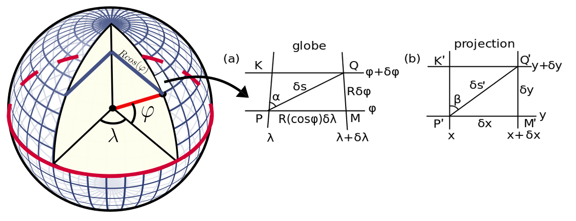
First Mercator divided the globe into graticules of equal spacing $\delta\varphi$ and $\delta\lambda$. Along the meridians the arc length of each graticule is $R\delta\varphi$. Along the parallels the radius of the circle is $R\cos(\varphi)$ so that the arc length is $(R\cos(\varphi))\delta\lambda$. The tangent can then be approximated as:
\[\tan(\alpha) \approx \frac{R\cos(\varphi)\delta\lambda}{R\delta\varphi}\]This graticule is then flattened into the rectangle with the following two requirements:
- The angles are kept constant by setting $\alpha =\beta$.
- The parallels are projected on to the $x$-axis like in the Lambert projection. This means $\delta x = R\delta \lambda$.
Therefore the transformation is:
\[\begin{align} \tan(\alpha) &= \tan(\beta) \\ \frac{R\cos(\varphi)\delta\lambda}{R\delta\varphi} &= \frac{\delta x}{\delta y} \\ \delta y &= \frac{\delta x}{\delta \lambda} \frac{1}{\cos(\varphi)} \delta \varphi = R \sec(\varphi) \delta \varphi \end{align}\]From here it is a small step to turn this into an integral. However, calculus was only properly invented a century later after Mercator published his map. Instead what Mercator did was realise that he could add up the stretch factors at each point. The stretch at graticule n is approximately the stretch of the graticule below it plus $R \sec(\varphi) \delta \varphi$. This can then be turned into a sum:
\[\begin{align} y_n &\approx R \sec(n \cdot \delta \varphi) \delta \varphi + y_{n-1} \\ &=\sum^{n}_{k=0} R \sec(k \cdot \delta \varphi) \delta \varphi \end{align}\]Using a constant value for $\delta \varphi $ Mercator was able to calculate the spacings for his map. Then he drew a world map over it. This is a modern rendering of the final result:
This map is very heavily distorted. Greenland now looks larger than Africa. The great circles lie along strange curves. But the rhumb lines are straight! Calculating the bearing can be done simply with a ruler and a protractor. No thinking or maths required! (And no fancy instruments on globes either.) In modern day terms we would say, it was a big hit with sailors.
For online maps the local projection is very important. If you are looking for directions in a city what matters most to you is that the roads look correct. This is why the Mercator map is used - to preserve angles between grids in roads. Other map projections don’t meet this simple requirement. A minor problem is that the scale changes at each latitude but online maps can easily calculate this at each point. Try this with Google Maps. For the same zoom factor, the scale bar is not the same length at each latitude. Also, along the equator, the scale bar has a minimum of 5m. Up near the poles, which is way more stretched out, the scale bar goes down to 1m. But you don’t notice this when zooming in on a specific point in the map.
For the record, if you are going to look at long distances on Google Maps it’s best to turn the “Globe view” option on.
Tables for trig, Mercator and logs
This is where things take an unexpected turn. But in order to understand how, I want to explain another part of history: mathematical tables. These days pocket calculators are so common that we have forgotten that they were once ubiquitous with maths. This was true even into the ’90s.
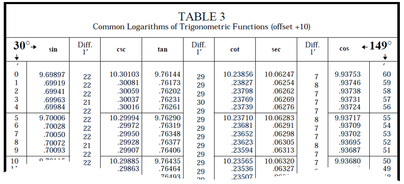
In the past if you wanted to calculate sec(36°) you could draw a big triangle and physically measure the angle and distances with the ruler. Then you could write out the long division calculation. More likely, however, you would read up the value in a trigonometry table. The numbers in these tables were painstakingly calculated using approximation formulas and trigonometric identities. But for the user they were very simple. You just had to look up the numbers and occasionally interpolate between numbers if you wanted higher accuracy. These tables had the added benefit of making inversion easy. For example if you looked for the number 1.23606 in the secant table, you would see it was next to 36°.
In 1599 Edward Wright published tables for the equator Mercator map equation. He used $\delta \varphi = 1’ = \frac{1}{60} 1^{\circ}$. He also gave the first mathematical description of the Mercator map which Mercator himself did not explain fully. This made it easier for others to make their own Mercator maps.
In 1614 John Napier introduced logarithms. This is the inverse of the exponential operation. In modern terms, the logarithm $y$ of $x$ to base $b$ is written as:
\[y = \log_b x \quad ; \quad b^y = x\]Napier’s main motivation was to find an easier way to do multiplication and division. For example from the laws of exponents:
\[2^a \div 2^b = 2^{a-b}\]Therefore a division can be done as follows:
\[3764 \div 873 = 2^{11.878} \div 2^{9.770} = 2^{2.108} = 4.311\]Where $\log_{2}(3764) = 11.878 $ and $\log_{2}(873) = 9.770 $
The logarithms again had to be painstakingly calculated through approximation calculations. Napier did this using a kinetic framework. While this idea may be unusual today, it has to do with how Napier originally visualised logarithms.6 His final table related numbers to logarithms and their sines.7 Here is an example:
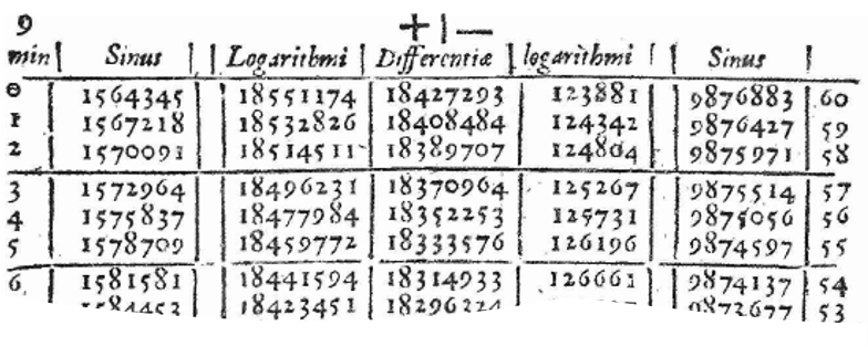
A user could use such a table to look up a logarithm with the added benefit that inversion was easy. These proved to be very popular - people clearly did not like doing multiplication and division in the past. Using addition and subtraction in their place also made calculations less error prone, especially with successive calculations.
Next, mathematicians extended these tables to other trigonometric functions:
In 1645, according to legend, a teacher named Henry Bond noticed something strange. The numbers in Wright’s Mercator table were similar to the numbers in a $\log_e(\tan(\varphi))$ table. They just were offset by a factor of 2 and 45° in the tables. So he essentially conjectured that:
\[\int_0^{\varphi_1} \sec(\varphi) d\varphi = \ln \left| \tan \left( \frac{\varphi_1}{2} + 45^\circ \right) \right |\]Mathematicians caught on to the claim but could not prove it. Calculus was still in its infancy. In 1668, 99 years after Mercator first made his map and 23 years after Bond gave the solution, it was finally proven by James Gregory. This proof however was considered long-winded and “wearisome”. In 1670 Isaac Barrow offered a more succinct proof through integration with partial fractions which can be found in 2.
Lastly, through trigonometric identities, it can be proven that the following three formulas are all equivalent:
\[\int \sec(\varphi) d\varphi = \begin{cases} \ln |\sec(\varphi) + \tan(\varphi) | + c \\ \ln \left| \tan \left( \frac{\varphi}{2} + 45^\circ \right) \right | + c\\ \frac{1}{2}\ln \left| \frac{1+\sin(\varphi)}{1-\sin(\varphi)} \right| + c \end{cases}\]Conclusion
This has been a long post. I hope you found this history as fascinating as I did. It truly is remarkable to me that this little formula on my first year exam had such a colourful and varied history. I really think it should be taught more in class. This was already tried and tested by 3. At a small scale they found it worked.
If you are more interested in how Google makes its map I highly suggest reading this blog post by a Google engineer: medium.com/google-design/google-maps-cb0326d165f5. Can you spot the integral of the secant in the Google code?
There is one last comment I would like to add. There is a lot of controversy surrounding the Mercator map. It is an extremely common projection. When I was younger I had a map of the world on my wall in the Mercator projection. However I hope you now fully appreciate its main purpose is navigation. Outside of that, it unnecessarily distorts shapes and in particular makes the Americas and Europe look much larger than they actually are. This has been linked, not without rationale, to colonialism and racism. For decades cartographers have bemoaned its use in applications where it really has no right to be.8 Here is even an amusing clip from a 90’s TV show: www.youtube.com/watch?v=vVX-PrBRtTY.
There are many different projections out there, all with their own purpose. My personal favourite is the Winkel Triple. It is the official map of the National Geographic Society. It is an elegant compromise between form and scale, in both the final representation and in the mathematics. A more general favourite is the Robinson Projection. It was designed with an “artistic approach”. Unlike the other projections, instead of using equations, Arthur H. Robinson manually fixed the scale factors at 5° intervals.
-
If I remember correctly, I was wandering through Wikipedia. Along the way I landed on the page for the Integral of the secant function, which includes a very brief history. ↩
-
Here is the proof by differentiation:
\[\begin{align} &\frac{d}{dx}\ln|\sec(x) + \tan(x)| \\ &= \frac{d}{dx}\ln|z| \quad\quad,\; z=\sec(x)+\tan(x) \\ &= \frac{1}{z} \frac{dz}{dx} \\ &= \frac{1}{\sec(x) + \tan(x)}(\sec(x)\tan(x) + \sec^2(x)) \\ &= \sec(x)\frac{\tan(x) + \sec(x)}{\sec(x) + \tan(x)} \\ &= \sec(x) \end{align}\]This uses the chain rule and assumes the following have been proved:
- $\frac{d}{dz}\ln(z) = \frac{1}{z}$
- $\frac{d}{dx} \tan(x) = \sec ^2(x)$
- $\frac{d}{dx} \sec(x) = \sec(x)\tan(x)$
-
The rate of change of the area with respect to the x-axis is the line (very thin rectangle) $y$. That is, $\frac{dA}{dx}=y \implies A=\int y dx$. ↩
-
The earth is approximated as a sphere for most mapping applications. Where more accuracy is required, there are extensions which can account for its deviations from a sphere. ↩
-
I am not sure if Mercator knew of this projection. It was only formally described by Johann Heinrich Lambert in 1772. However, I think it is the easiest way to visualise the Mercator projection construction so I have used it here anyway. There are other constructions for it but I do not think they are helpful. The Mercator just is a very unnatural projection. ↩
-
Here is a brief overview of Napier’s method: He compared a particle traveling along an infinite line with another particle traveling along a finite line of length $R$. The first particle travels at a uniform speed $\frac{dx_1}{dt}=1$, while the second particle travels at a speed proportional to the distance it has left along the finite line, $\frac{dx_2}{dt}=R-x_2$. The distance the second particle travels is related to the first particle with this differential equation: $\frac{dx_2}{dx_1}=R-x_2$. Its solution is:
\[\begin{align} x_1 &= \log_{\frac{1}{e}} \left(\frac{R-x_2}{R}\right) \\ &\approx \log_{\left(1-\frac{1}{R}\right)^R}\left(\sin(\theta) \right) \end{align}\]More information can be found at https://plus.maths.org/content/dynamic-logarithms. ↩
-
My original article said that logarithmic trigonometric tables appeared after normal logarithmic tables. However because of Napier’s unusual derivation of the approximation formula, this is not true. This was pointed out to me on comments on this post on HackerNews. You can see these here. ↩
-
There are several popular Coronavirus map trackers that use the Mercator projection. How sad. ↩